Earlier in Aqualytics
Aqualytics has been helping water treatment professionals send service reports for a few years now, but until recently there wasn’t a good place to share what’s new. Before getting into the latest updates, here’s a look back at a few features we added during that time.
Customer Dashboards
To help your customers get what they need, we added Dashboards. After you invite them, people at your accounts can sign in to the dashboard. From there, they can access past reports:
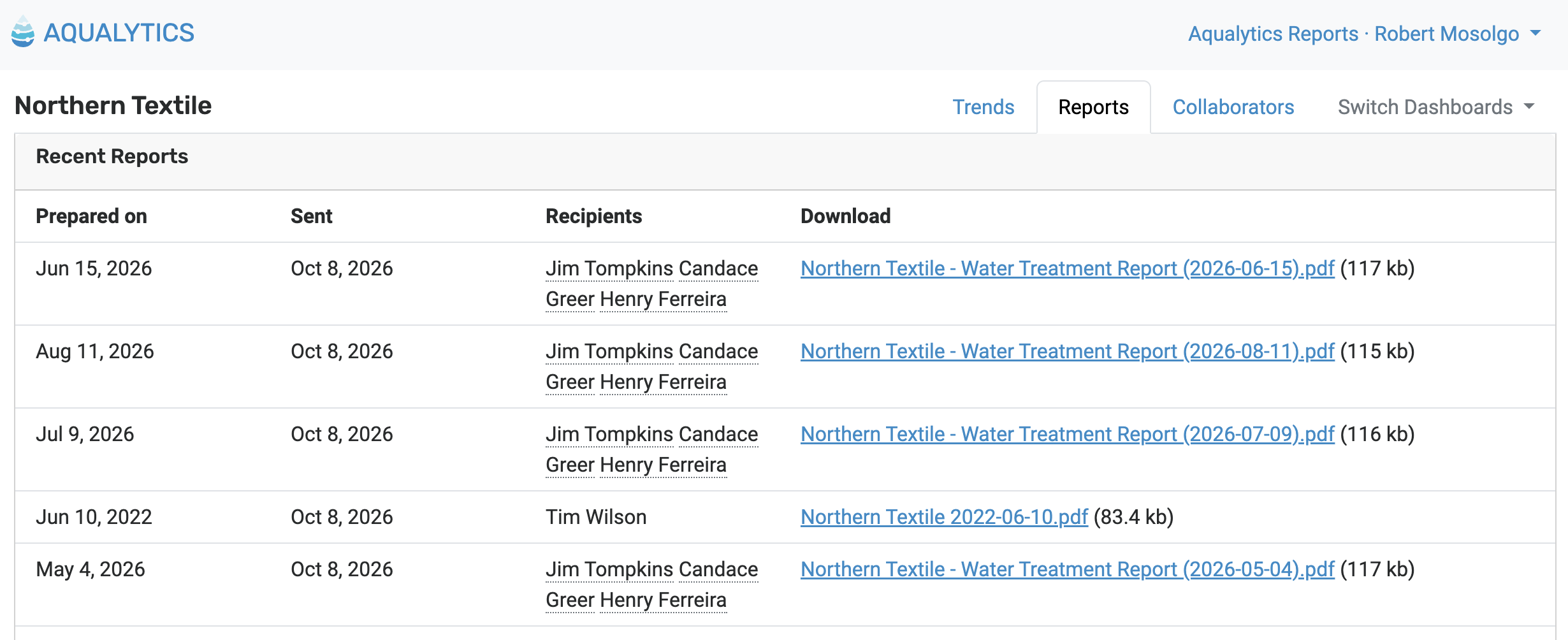
And make their own trends with data in Aqualytics:
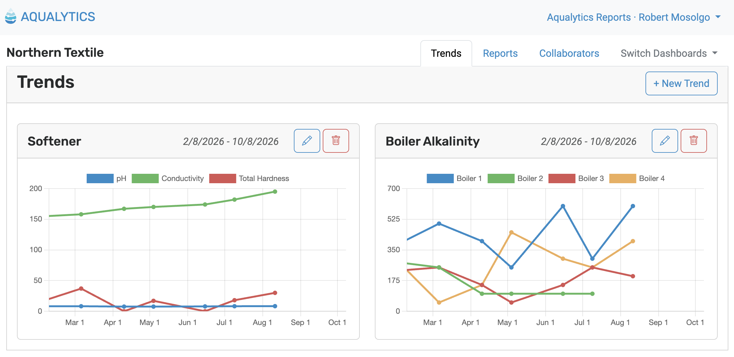
For each person at an account, you choose whether they receive reports by email, have access to the dashboard, or both.
Account Folders
When you have more than a handful of accounts, folders keep them organized. Group accounts by territory, by industry, or however you think about your book of business, then drag and drop accounts between folders:
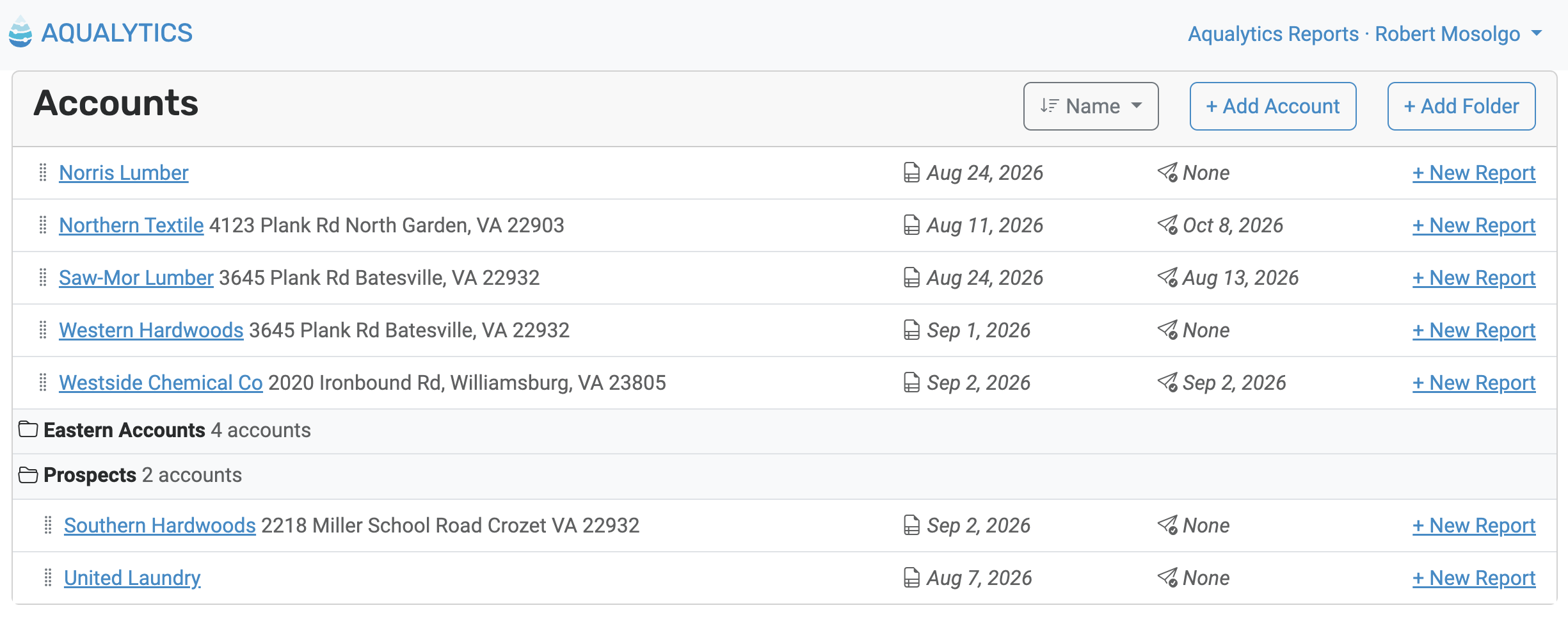
Aqualytics remembers which folders you left open, so your list looks the same when you come back.
Trends over Any Timeframe
Trend charts aren’t limited to a fixed window. For each trend, pick a number of months or days to look back – a few weeks for a system you’re dialing in, or a couple of years to show a customer how far they’ve come.
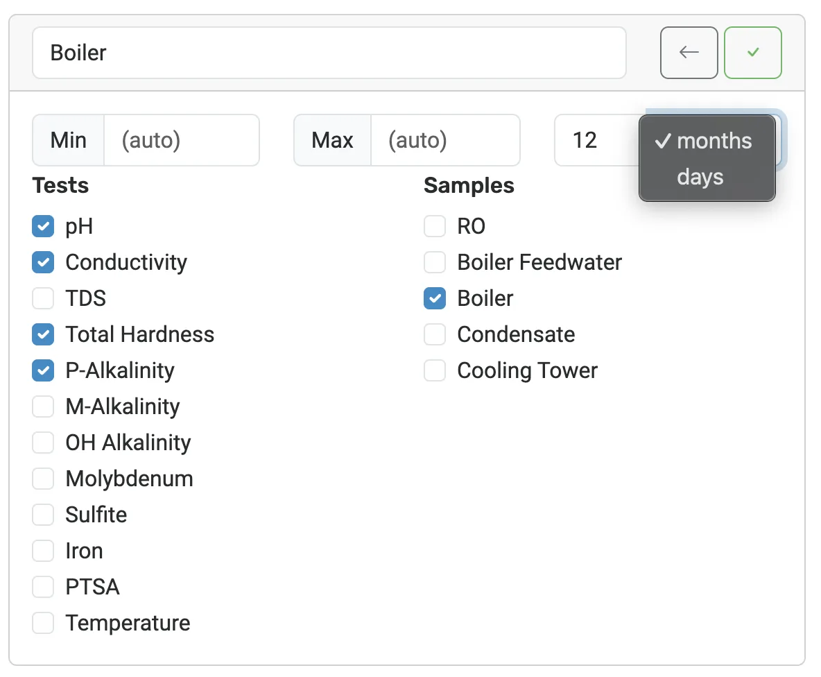
Along the way, the charts themselves got easier to read, with rounder numbers on the vertical axis and matching charts on the web and in the PDF.
Formatted Comments
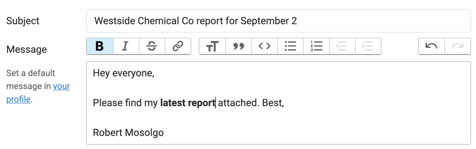
Report comments support rich text, so you can use bold, italics, and lists to make sure your recommendations stand out. The same goes for the default message that accompanies your reports.
Free Trial
You can try Aqualytics for free before choosing a plan. Set up an account, prepare a report, and see how it looks before you commit. See Pricing for the details.
What’s Next
From here on, new features will be announced right here. Subscribe on the Updates page to get them in your inbox.

Ready for better service reports?
Get started with the best software for water treatment service reports.